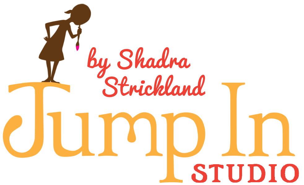
With PLEASE, LOUISE coming out next month, I have spent a lot of time working on promotional items. I have a little design background and am always excited when I have a chance to wear that hat. Along with posters and bookmarks (giveaways coming soon!!!!!!!), I did a little more work on the logo for Jump In Studio.

I find that there are designers who illustrate, illustrators who design, and then there is that magical combination of the two which I like to call the “designistrator”. Designistrators are those who blend illustration and design so seamlessly, that you can’t tell where design ends and illustration begins. Most of my favorite illustrators play with elements and principles of design in a very intentional and informed way, but I can’t really name a slew of designistrators off the top of my head. John Hendrix is a good example. He is a fantastic hand letterer and obviously has a bit of type geek in him, but his love of drawing shines through every piece.
Though a letterer by trade, Jessica Hische is one of my recent inspirations. I share much of her work with my students who fancy themselves drawers of type. I wouldn’t consider her a designistrator because her work is weighted more on the design end, but at the end of the day, jessicahische.is/awesome. Check out her sketchblog for more inspiration!
Thinking about a logo for Jump In Studio, I began with a few sketches. My initial concept was to show a girlchild contemplating a big jump. That evolved into more literal interpretations of her springing off the initial cap and cannonballing into the type. I posted my favorites on facebook, and though most people like the literal interpretation of the studio, I favorited the more thoughtful and suggestive concept.
After ignoring all of my facebook friends (sorry homies), I decided to take the less literal approach into illustrator. I traced my initial thumbnail onto bristol and inked it, then scanned it into photoshop and did a live trace in illustrator. Now, if I were a designigangsta (which I am not), I would have drawn the letter forms with the pen tool directly into illustrator (like J. Hische…who is awesome). My first live trace attempt was a disaster. The inking wasn’t smooth and when it traced, my letterforms had about a gazillion points that needed to be removed and cleaned. After throwing four hours away working from the live trace, I realized it was super ugly and wasn’t going to get much better. I took a lunch break, and came back to try again, this time, starting with a base typeface that had characteristics similar to the letterforms I drew in my initial sketch. This is not ideal and most of you type geeks out there are probably cringing at the thought of this bastardization of letterforms. Sorry homies.
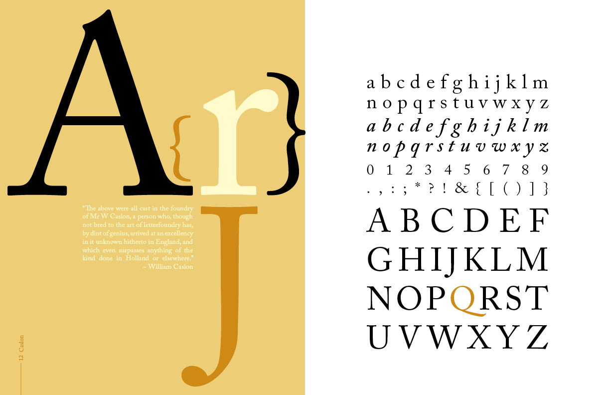
So, I started with a Caslon base. I wanted a classic feeling serif typeface with a nice weighty slab, and nice contrast. I also wanted some decorative elements to give it more of a hand drawn look, but without being too whimsical.

In illustrator I extended the tail of the “J”, bent the arms of the J, widened the arcs, and lengthened the ascenders and descenders. I also thinned the stems a bit. After more facebook feedback, I will remove the “inc.” and clean the tails a bit more. Some still want to see her actually jumping. I’ll see if I can carve out a little more time this weekend to work on an alternate. Stay tuned for the final design!

See the final design here!


