
I usually shy away from editorial assignments. Typically it’s because I’m busy with book work, but mostly it’s because I have always been nervous about the quick turnaround. Well, those nerves got set aside when SU almun, Jim Cooke, asked me to illustrate Veronica Chamber’s review of Honorée Jeffers’ novel, The Love Songs of W.E.B. DuBois. In the initial email from Jim, he wrote:
This line stood out to me: “the way she holds up the pieces of memory and history to the light — that illuminates the true bounty of Jeffers’s work. Too often, the archives of black Americans are filled about what happened to black people — not how they lived and breathed, thought, wondered, wandered, dreamed and prayed.”
I wanted to make something haunting, beautiful, elegant, and most importantly, southern. The main family is rooted in the fictional town of Chicasetta, GA. I grew up in Atlanta, and have been to Eatonton, the author’s hometown, so I knew I wanted to make something special. I wanted to play with my favorite southern flower, the dogwood tree. My grandmother grew four of these beautiful trees at the base of her yard. They always stood out to me as the most beautiful things on her street. As a little girl, around 9 or so, I used to climb up in them and watch cars drive by-hidden from the world. Until one day, I came home from school and she had cut down on a whim.

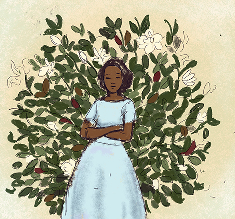


My initial idea was to create a quiet, moody scene. A space with light filtering in and family portraits on the wall with a little still life of peaches and dogwood branches on a table. I then thought of a young woman standing in front of a bouquet of magnolia flowers. Next, I played around with the famous fresco painting Still Life with Peaches and Water Jar from Herculaneum, Italy, c. 62-69, using dogwoods and ants as a sign of foreboding. My least favorite was an image of a young sharecropper looking into a futuristic city. At this point my brain was melting a little bit. And lastly, a hail mary pass of the main character holding a dogwood twig obscuring her face with light filtering throughout. This one was my second favorite but I just thought it might be too easy of a solution.
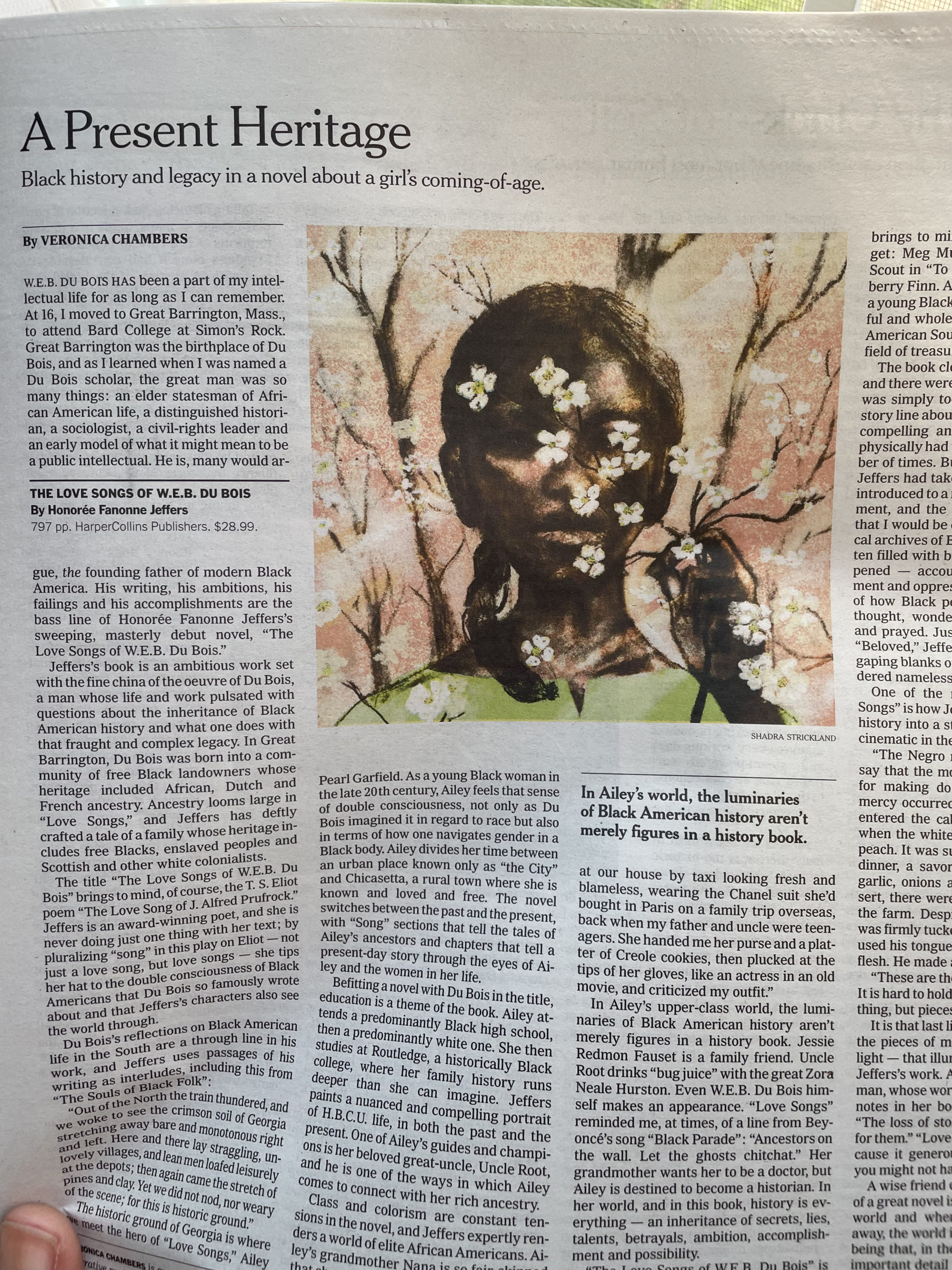
In the end, the ADs chose the portrait. It was such fun to make this and I am thrilled at how it turned out in the paper. I’m looking forward to adding more editorial work to my portfolio! Not bad for a first timer, huh?